Goto Thread: PreviousNext
Goto:  Message ListNew TopicSearchLog In
Goto Page: Previous1234AllNext
Current Page: 2 of 4
Re: Latest HPL collection
Posted by: Absquatch (IP Logged)
Date: 20 April, 2011 08:12PM
For old paperbound book cover aficionados, here's a link to a nice site that has all the Ballantine Adult Fantasy series covers. I love these things, myself. Of course, they are pure kitsch, but, unlike the kitschy covers for the CAS complete tales volumes, they are kitsch done with panache and imagination, full bore.

Re: Latest HPL collection
Posted by: Ken K. (IP Logged)
Date: 21 April, 2011 07:16PM
Absquatch, thanks for posting that link! It was wonderful seeing some of those long-gone covers again, as well as many I had never encountered before.

About the word "kitsch"--my dictionary defines it as "artistic or literary material of low quality designed to appeal to current popular taste". If you accept this definition as true, than of course most book covers are "kitschy"--if they don't appeal to current popular taste, they won't be bought! Indeed, every book designer must have kitsch in mind if the book is to turn a profit!

Where I run into problems with the dictionary definition is, predictably, the part equating "low quality" with "current popular taste". As you point out, many of the Ballantine Adult Fantasy covers are quite wonderful (and redolent of the late 60's/early 70's era). If this style of cover art has fallen out of favor with the public, does that mean these covers can no longer be regarded as "kitsch"?

Re: Latest HPL collection
Posted by: Absquatch (IP Logged)
Date: 22 April, 2011 08:10AM
I am glad that you enjoyed the linked material. The Lovecraft covers, in particular, are mind boggling.

As to your question, it's a fairly complicated one. Since popular taste is often specific to its era, then I suppose kitsch is, as well, although I have no trouble using the label with that sort of relativity in mind.

Re: Latest HPL collection
Posted by: Ken K. (IP Logged)
Date: 22 April, 2011 05:42PM
I've been thinking about my dictionary's definition of "kitsch" and it seems to be implying that the word is equivalent to (or at least similar to) the term "hackwork"--that is, work produced by rigidly adhering to a set formula for the consumer's satisfaction and containing little in the way of originality or novelty. The work can be produced and consumed with little creative energy or thought. In short, hackwork is lazy. Perhaps this is where the "low quality" part of the original definition comes from.

A problem with fantasy, science fiction, and horror is that the genres are simply rife with symbols which have degenerated into cliches. I don't envy the cover artists who must deploy these cliches in a fresh way.

Re: Latest HPL collection
Posted by: calonlan (IP Logged)
Date: 22 April, 2011 06:13PM
For a proper definition, ask your friendly neighborhood Rabbi -

Re: Latest HPL collection
Posted by: Stan (IP Logged)
Date: 22 April, 2011 06:31PM
Well, I don't really want to get into this whole debate. However, for an interesting gloss on the word kitsch and all its connotations, see here:

Kitsch

Re: Latest HPL collection
Posted by: Absquatch (IP Logged)
Date: 23 April, 2011 07:16AM
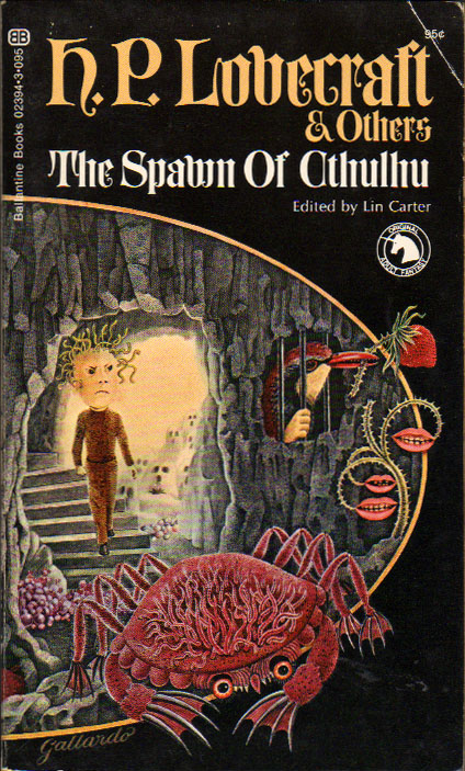
Of course, the whole business is subjective, and tastes will vary. For instance, some here obviously like Van Hollander's form of kitsch, and have taken offense at my criticism of it. No one, however, should mistake the force of a given argument in such realms, be it pro or con, for an assertion of objective truth.

Myself, I can enjoy the Ballantine covers because they are unpretentious, imaginative, in their own way, and often simply so bad that they are hilariously funny. Also, they are fitting for mass market paperbound books, and may even serve a legitimate purpose as eye-catchers in a competitive market. On the other hand, I dislike such covers for the same reason that I dislike the CAS covers: They do not do justice to the dignity of the works, themselves, and, indeed, even trivialize them, in some instances. Again, though, in a mass market setting, this is at least marginally excusable, but not, in my view, in expensive limited editions published by specialty presses that will be sold primarily via mail order.

Quote:
I don't envy the cover artists who must deploy these cliches in a fresh way.

Indeed, and part of what I find entertaining about the Ballantine covers is the game of spotting the quotations from the likes of Bosch, Bruegel, Magritte, and Dali.

Re: Latest HPL collection
Posted by: Jojo Lapin X (IP Logged)
Date: 23 April, 2011 01:29PM
I am not sure what you are talking about. The covers by Gervasio Gallardo are highly original, striking, and certainly nothing like the average paperback cover painting of the day. (Although it has to be said that the standards for paperback cover art were in general much higher in the late 1960s and early 70s than they are today. I miss the time when SF paperbacks could have paintings by Richard Powers on them.)

Re: Latest HPL collection
Posted by: Absquatch (IP Logged)
Date: 23 April, 2011 02:56PM
Quote:
I am not sure what you are talking about. The covers by Gervasio Gallardo are highly original [...]

Highly original? Maybe you're referring to this one? (Compare to this Salvador Dali painting). Or this one, which quotes directly from Bosch's Garden of Earthly Delights? Ah, no, you must mean this one--no, wait a minute, it couldn't be.

I am afraid I am the one isn't sure what you are talking about, apropos of Gallardo's originality. He shows good taste in his sources, though; that, I'll grant. He was hardly alone, though. Surrealism was practically "in the water", visually speaking, during the late '60's and well into the '70's.


Edited 1 time(s). Last edit at 23 Apr 11 | 02:57PM by Absquatch.

Re: Latest HPL collection
Posted by: Jojo Lapin X (IP Logged)
Date: 24 April, 2011 02:22AM
No, I was not thinking of those, specifically. This one is an old favorite of mine, though. Now you will tell me it is a ripoff of Botticelli.

Re: Latest HPL collection
Posted by: Ken K. (IP Logged)
Date: 24 April, 2011 03:23AM
Yes, the central figure is probably a "borrowing" from Botticelli; but the rest of the painting is Gallardo's. Besides, if you can't make a classical allusion in the cover to a CAS collection, where can you? Gallardo was probably counting on the reader picking up on the reference.

Re: Latest HPL collection
Posted by: Jojo Lapin X (IP Logged)
Date: 24 April, 2011 05:03AM
I should add that covers like this and those on the British Panther editions are what attracted me to Clark Ashton Smith in the first place, so, for better or worse, they are inextricably linked in my mind.

Re: Latest HPL collection
Posted by: jimrockhill2001 (IP Logged)
Date: 24 April, 2011 08:12AM
Ken K. Wrote:
-------------------------------------------------------
> Yes, the central figure is probably a "borrowing"
> from Botticelli; but the rest of the painting is
> Gallardo's. Besides, if you can't make a
> classical allusion in the cover to a CAS
> collection, where can you? Gallardo was probably
> counting on the reader picking up on the
> reference.

Exactly - just as Magritte would have done, and Gallardo is very much in the tradition of Magritte.

Re: Latest HPL collection
Posted by: Absquatch (IP Logged)
Date: 25 April, 2011 05:55AM
Quote:
Now you will tell me it is a ripoff of Botticelli.

No, as before, I will simply tell you, and others, that it is evidence against calling Gallardo's work "original".

Allusions: Allusions rarely form the centerpiece of an entire work, as the Botticelli elements do on the Xiccarph cover. When they do form the centerpiece of a work, they are called "adaptations", "pastiches", or, less politely, plagiarism. To my mind, calling the Xiccarph cover an allusion is like saying that West Side Story "alludes" to Romeo and Juliet.

Anyway, as I mentioned, I get a kick out of this stuff, too; I just don't take it too seriously. Likewise, this discussion. I repeat that I am glad that others are enjoying the linked page.


Edited 1 time(s). Last edit at 25 Apr 11 | 06:00AM by Absquatch.

Re: Latest HPL collection
Posted by: Ken K. (IP Logged)
Date: 26 April, 2011 12:57PM
An eminently sensible attitude. I'm enjoying the conversation in this thread as well; having to clarify my own positions is good mental exercise.

The function of a paperback book cover is fairly clear: it has to stand out from the competition at the bookstand. If it catches your eye and persuades you to pick the book up, note the author's name, read the back cover copy, and flip it open to the contents page--that's all a cover artist can reasonably hope for. The author's words have to do the rest.

The covers in the gallery to which Absquatch has so thoughtfully directed us fulfill their function, at least in my case. Seeing them en masse I was seized by a desire to reach through the screen and virtually turn them over to read the copy on the back!

Goto Page: Previous1234AllNext
Current Page: 2 of 4


Sorry, only registered users may post in this forum.
Top of Page